A living room wall is rarely empty. By the time anyone thinks about built-ins there is usually a fireplace somewhere on it, a window that will not move, a door that swings into the room, a vent near the floor, a bulkhead overhead and an outlet in exactly the wrong place.
The built-in should be designed around what is already there, not imposed on it. That sounds obvious and it is the single thing most often got backwards: a cabinet layout gets drawn first, then the room’s actual conditions are discovered, and the result is a run of joinery with awkward filler panels, a blocked vent and a television at the wrong height.
This guide works in the order the decisions actually have to happen — survey the wall, resolve the fireplace and the television, work around the openings and the ceiling, then let the cabinetry follow. It is about design and planning decisions rather than cabinet construction; for panel products, carcass construction and hardware, the complete guide to custom cabinets and built-in storage covers that ground and this article does not repeat it.
Start by surveying the wall
Before any cabinet is drawn, produce an honest record of everything on that wall that cannot move, and everything that could move but only at a cost.
Three categories, and the distinction matters:
- Genuinely fixed. Structural columns, beams, the chimney and its flue, load-bearing elements, window and door openings, the ceiling line.
- Movable at a cost. Outlets and switches, data points, a radiator, a supply vent or cold-air return, a light fitting, sometimes a non-structural bulkhead. Each has a price and a trade involved, and knowing which is which changes the design brief.
- Free to change. Paint, trim profiles, the furniture layout, where you sit.
Then measure properly: overall wall width, ceiling height at both ends and in the middle, the position and size of every opening, the depth of any projection, the height of the baseboard, and whether the walls are plumb, the corners square and the floor level. In an older house, assume none of the last three and verify.
One more thing belongs in the survey, and it is the one people leave out: where you actually sit. The seating position determines the television height, the sightlines and which parts of the wall are seen most. A built-in designed to the wall alone, without the furniture layout, gets the viewing geometry wrong.
Depth: the decision that governs everything else
Depth comes from what has to fit inside, not from a standard. Get it wrong in one direction and equipment does not fit; wrong in the other and the room loses floor area it could not spare.
What drives it:
- Books. Shallow. Most books are comfortable on a shelf far shallower than a base cabinet, and deep shelving means two rows and a lost back row.
- Media equipment. The deepest item on the list, and the one that sets the base cabinet depth — a receiver or console plus the cables standing off the back needs real clearance behind it. Measure the actual units, including connectors.
- Drawers and general storage. Moderate. Deeper is not better; things get lost.
- Display objects. Shallow, and shallow looks better — a deep shelf makes a small object look stranded.
The useful conclusion is that a single depth for the whole run is usually the wrong answer. A stepped section — deeper cabinets at the base, shallower shelving above — is the standard resolution, and it does two things at once: it gives the equipment the depth it needs while keeping the upper wall visually light, and the step itself creates a horizontal line that can be used to align with a window head or a mantel.
Where the room is tight, remember that every inch of depth is an inch off the floor area. A shallower run over a longer wall almost always beats a deep run over a short one.
Designing around the fireplace
The fireplace is usually the most demanding element on the wall, because it is fixed, it is visually dominant, and it is the one component with genuine safety requirements attached to it.
Clearances and heat — how to get this right
The clearances that apply to your fireplace come from that specific appliance’s installation instructions and from the requirements in force locally. They are not something to take from an article, including this one.
What is worth understanding as principles, so you can have an informed conversation:
- Combustible materials — timber, MDF, most trim — need separation from the firebox opening, and the required separation generally increases the further the material projects from the wall. A deep mantel is treated differently from a flush one.
- Non-combustible materials such as stone, tile, concrete and metal behave differently, which is why the area immediately around a firebox is usually detailed in one of them.
- A manufactured or listed appliance is supplied with installation instructions that specify its clearances, and those instructions govern. This is why “what did the last project do” is not a safe basis for a new one.
- Anything electronic mounted nearby has its own operating temperature limits set by its manufacturer, which is a separate question from the fireplace’s clearances.
The practical sequence: confirm the appliance and obtain its documentation before the millwork is designed, because those figures set the boundary the cabinetry has to respect. Where the fireplace and the joinery form one element, they should be drawn as one element. That overlap is covered under fireplaces and feature walls.
Two further points that are easy to miss. Service access — gas appliances have controls, valves and components that need to be reachable, and cabinetry built tight around them can make routine service difficult or impossible; ask where access is needed before the panels are made. And ventilation requirements belong to the appliance, not to the cabinet: if a unit requires air movement around it, joinery must not obstruct it.
A fireplace centred on the wall
The easiest case and the one that tempts people into the least interesting design. Matching runs either side, closed storage at the base and shelving above, is a reliable composition, but check the centring rather than assuming it. Chimney breasts are frequently a few inches off centre, and a layout drawn as symmetrical against a wall that is not produces two bays of visibly different width, which reads worse than a deliberate asymmetry.
Where the fireplace is genuinely centred, the alcoves either side are usually the best storage in the room: already recessed, already framed by the chimney breast, and needing only to be fitted out.
A fireplace off to one side
More common than centred, and more interesting to resolve. Do not fight it — a symmetrical layout on an asymmetrical wall means inventing a false bay to balance a real one, which is both wasteful and unconvincing.
Three resolutions that work. Let the composition be deliberately asymmetrical, with a tall run on the long side and something low on the short side, balanced by weight rather than by width. Run the cabinetry the full width and let the fireplace sit within it as one feature among several, which suppresses the off-centre position by giving the eye a continuous horizontal to read instead. Or treat the short side as a feature — a single tall cabinet, a seat, a full-height panel, so the imbalance looks chosen.
Low-profile and linear fireplaces
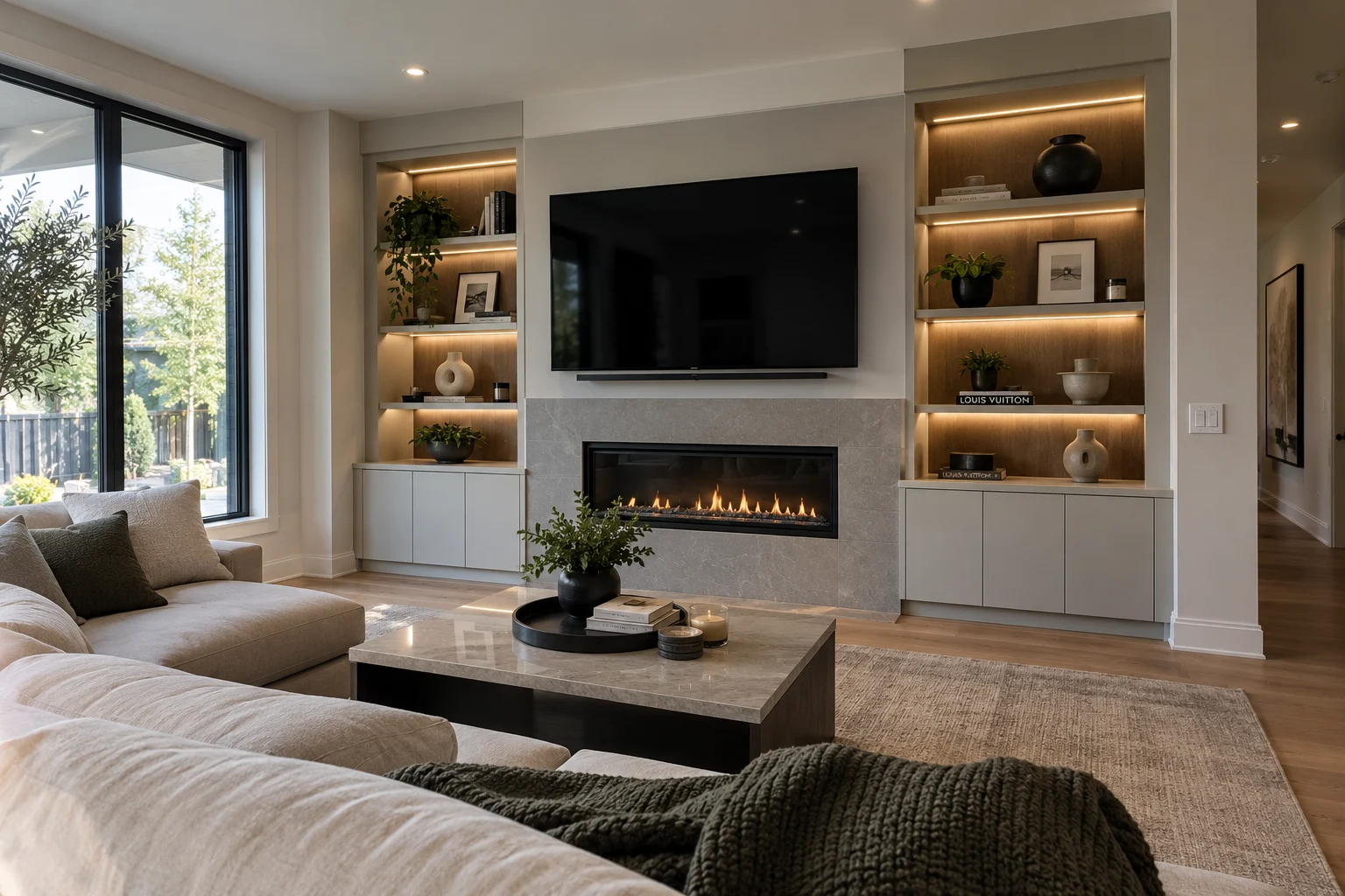
A long, low firebox changes the composition entirely: it produces a strong horizontal that the cabinetry should either continue or deliberately contrast, and it usually invites a full-width feature wall rather than two alcoves. It also frees the wall above in a way a traditional firebox does not — though what can go there still depends on the appliance’s own requirements.
Open niches, closed storage, or both
Around a fireplace the usual answer is a mix, and the reasoning is practical rather than stylistic. Closed cabinetry at the lower level takes the things nobody wants on display and keeps them away from the hearth area. Open niches at and above eye level carry the objects that are meant to be seen. Where a niche sits close to the firebox, the material choice and the clearance question both apply to it, so it is a detail to confirm rather than assume.
The television and the media wall
Screen size, position and mount all have to be settled before the millwork dimensions are finalised. They determine the opening, the structure behind it, and the services that have to arrive at that exact point.
Height comes from where you sit
The convention among installers is that the centre of the screen sits at roughly seated eye level, which for most adults on a normal sofa falls somewhere in the low-to-mid forties of inches from the floor. Screen size then determines how far up the wall the bottom edge lands.
Treat that as a starting point rather than a rule, because the right number is derived from your own furniture. Sit where you will actually watch from, in the chair you will actually use, and measure floor to eye. A seat with a deep recline puts the eye lower; a firm upright sofa puts it higher. Eyes looking straight ahead or slightly down stay comfortable for a long film; eyes angled upward do not.
Viewing distance and screen size are related in the same way. The commonly used range puts the seating somewhere between about one and a half and two and a half times the screen’s diagonal away from it — useful for sanity-checking a screen size against a room before the joinery is built around it.
Above the fireplace, or beside it
This is the question that comes up in almost every living room, and it is a genuine trade-off rather than a rule.
| Consideration | TV above the fireplace | TV beside the fireplace |
|---|---|---|
| Viewing angle | Usually higher than ideal | Can be set to seated eye level |
| Heat exposure | Must be checked against both manufacturers | Largely avoided |
| Wall used | One wall does both jobs | Needs more wall width |
| Room focus | Single focal point | Two competing focal points |
| Furniture layout | Simple — everything faces one wall | Seating must favour one or compromise |
| Cable routing | Longer run, often past the firebox | Shorter, simpler |
Above the fireplace is chosen most often because it solves the layout problem in a room with only one usable wall. If you go that way, two things need checking properly rather than assumed: the appliance’s clearance requirements for whatever is mounted above it, and the television manufacturer’s stated operating temperature limits. A raised hearth, a deep mantel or a heat deflector can change the picture, and a low-profile linear fireplace changes it again.
Beside the fireplace gives the better viewing geometry and sidesteps the heat question, at the cost of wall width and a room with two focal points. Where the wall allows it, it is usually the more comfortable room to sit in.
Equipment, power, data and heat
Whatever sits behind or below the screen has requirements the joinery has to accommodate, and all of them are cheap to plan and expensive to retrofit.
- Services at the screen position. Power and data need to arrive at the exact point the screen will be, not approximately. Confirm the mount type first — a fixed flat mount, a tilting one and a full-motion arm all sit at different distances off the wall and need different structure behind them.
- Blocking. A screen and its mount want solid backing, fixed while the wall is open. Retrofitting support afterwards means opening the wall again.
- Heat from components. Receivers, consoles and set-top boxes generate warmth, and a sealed compartment traps it. Compartments holding active equipment need a deliberate path for air in and out — a ventilated back panel, a gap at the plinth, or a grille — decided at design stage rather than drilled in later.
- Signals through doors. Some equipment is still controlled by infrared, which will not pass through a solid door. If components live behind closed fronts, that is a decision to make consciously — glass or mesh fronts, or a repeater.
- Reaching the back. Something will eventually need unplugging. A design that requires dismantling the joinery to reach a socket is a design that will be resented. Removable back panels, a service gap or a lift-out shelf all solve it.
- Speakers. Whether sound is a soundbar, in-wall speakers or freestanding units changes the elevation and sometimes the structure. Decide before, not after.
On cabling, the principle is simple: routes have to be part of the joinery drawing. Vertical chases between compartments, openings where cables pass between sections, and a clear path from the equipment position to the screen position. Cable routes designed in disappear; cable routes added afterwards are visible for the life of the unit.
Windows, doors and openings
Openings do two things to a built-in. They set the horizontal lines the cabinetry has to agree with, and they set the clearances it must not take.
Windows. The most useful move is to align the cabinetry with lines the window already establishes — running a shelf or the top of a base run level with the window sill, or a cornice level with the head. Where cabinetry runs beside a window, stopping short of the reveal keeps the casing readable and avoids a cramped junction. Keep in mind that anything built across a window reduces daylight, which in a north-facing Toronto living room is a real loss; a low run under a window with shelving flanking it usually serves better than a tall run beside it. Where blinds or curtains are involved, the stack and the track have to be allowed for.
Doors and openings. Check the swing with a plan in front of you, not by eye. A door that opens against the end of a built-in needs either a stop, a shortened run, or a change of swing. Where a run ends near an opening, stopping a few inches clear reads far better than dying awkwardly into the casing. A cased opening between rooms is a sightline as well as a passage — what you see through it from the next room is part of the composition.
Vents and returns. This is the most common serious error on the list. A supply vent or a cold-air return covered by cabinetry compromises the heating and cooling of the room, and it is expensive to discover afterwards. Options are to design a clear route with a grille through the joinery, to relocate the vent as part of the work, or to arrange the layout so the vent stays in open wall. All three are fine; ignoring it is not.
Radiators. Still present in a great many older Toronto houses. Boxing one in restricts its output and can make servicing difficult, so if it is to be enclosed the enclosure needs to be designed for airflow, and the valve needs to stay reachable. Relocating it is a plumbing decision to take early.
Baseboard. Decide early whether the run sits on top of the existing baseboard, whether the baseboard is cut out so the joinery meets the wall, or whether a matching plinth continues the profile. Each looks different and each has to be drawn. Baseboard left unresolved is what makes a built-in look like a cabinet pushed against a wall.
Ceilings, bulkheads and wall conditions
What happens at the top of the run is what makes a built-in read as architecture rather than furniture.
- Standard ceilings. Taking the cabinetry to the ceiling, with a scribed filler or a cornice closing the joint, almost always looks better than stopping short and leaving a dust ledge.
- High ceilings. Full height gives drama but puts the upper shelves out of reach, so the top band should hold display rather than anything used. An alternative is a deliberate horizontal break, a cornice at door head height with the wall above left clear, which often suits the room’s proportions better than a very tall run.
- Bulkheads and soffits. Extremely common in Toronto basements and in houses where services were rerouted. A bulkhead can be worked with rather than against: run the cabinetry to its underside so it reads as intentional, or step the run to follow it. What does not work is ignoring it and leaving a ragged gap.
- Sloped and stepped ceilings. The top of the run has to follow the ceiling, which means a raked or stepped profile drawn to the measured line. Where the ceiling drops below useful shelf height, stop the shelving and let that zone become a low cabinet, a bench or open wall — shelves that taper away to nothing look like an oversight.
- Out-of-plumb walls and unsquare corners. Standard in older housing, and handled by scribing the end panels rather than by hoping a gap will not show. What matters at design stage is that you allow for it: a run drawn edge-to-edge with no filler allowance has nowhere to absorb a wall that leans, and the discrepancy then lands in a door gap where it is obvious.
- Columns and projections. Either absorb them into the depth of the run so the face stays flat, or express them as a division between bays. Half-absorbing a projection is the one option that always looks like a mistake.
Ceiling height is rarely consistent across a wall in an older house. Measure at both ends and in the middle, and design the top detail to absorb the difference rather than assuming a level line.
Symmetry, and when not to force it
Visual balance matters. Mathematically identical cabinet widths do not. Those are different things, and confusing them is what produces contorted layouts.
Symmetry earns its place when the wall is genuinely symmetrical — a centred chimney breast with equal alcoves, or a blank wall with a centred screen. In those cases it is restful and obviously right.
It should not be forced when the wall is not symmetrical to begin with. Common cases and what to do instead:
- Off-centre fireplace. Balance by visual weight instead. A tall run on one side answered by a lower, longer element on the other reads as composed; two forced-equal bays read as a mistake.
- A single window on one side. The window is itself a strong element; treat it as one half of the composition rather than something to be mirrored.
- Two unequal windows. Align to the lines they share — the sill and head heights — rather than trying to equalise the widths between them.
- Screen offset from centre. Let the cabinetry acknowledge it. A screen forced to the middle of a wall whose real centre is elsewhere looks wrong from the sofa, which is the only place it is judged from.
- A doorway close to one end. Stop the run clear of it and accept the shorter side, rather than compressing bays to keep them equal.
- A structural obstruction. Express it as a division. A column that becomes a deliberate partition between two bays disappears; a column half-hidden behind a panel does not.
The device that makes asymmetry work is a consistent alignment: one strong horizontal — the top of the base cabinets, a shelf line, the cornice — carried across the whole wall. With that in place, bays of different widths read as a designed composition. Without it, the same bays read as an accident.
What should show and what should disappear
Decide this from what you own rather than from a ratio. The honest test is to list what actually has to live in this room and sort it into things worth looking at and things that simply need a home.
Typically worth showing: books you use, a few objects with some presence, framed pieces, a plant. These belong at and slightly above eye level from a seated position, on shallow shelving, with enough empty space around them that they read as chosen rather than stored.
Typically worth hiding: board games, controllers and remotes, spare cables, paperwork, craft supplies, children’s toys, the things that accumulate on every surface in a family room. These want closed fronts and are the reason a living room with built-ins stays tidier than one without.
Specific provisions that repay the thought:
- A charging point inside a cabinet or drawer, so devices charge out of sight rather than on a side table. Worth planning with the electrical work rather than adding afterwards.
- A shallow drawer at an easy height for remotes, which otherwise live on the arm of the sofa permanently.
- Deep lower storage for toys, at a height a child can reach, if this is a family room. Drawers beat cupboards here — a child can open a drawer and see what is in it.
- Somewhere for seasonal and occasional items, in the top band or the least convenient cupboard.
- Adjustable shelving throughout. Books, objects and equipment all change; fixed shelves lock in a moment.
One proportion caution in each direction. A wall of nothing but open shelving demands constant tidiness and makes a room busy. A wall of nothing but doors is bland and wastes the chance to give the room some character. A mix, weighted toward closed storage in a family room and toward display in a formal one, is the reliable answer. For storage that has to double as a workspace, built-ins and home office covers that overlap.
Lighting
Lighting has to be in the millwork drawing, because every part of it is built into the joinery or the wall behind it: the supply, the channel it sits in, the switch, and the place the driver lives. Added afterwards, it is either visible or impossible.
What works in a living room built-in:
- Shelf lighting — a strip in a channel at the front underside of each shelf, washing the shelf below. The most effective single move, and what makes display shelving read as intentional after dark.
- Back-of-niche lighting — grazing a rear panel to give depth, particularly good where the back is a stone or textured surface.
- Interior cabinet lighting on a door switch or sensor, for closed storage that is otherwise a dark hole.
- Recessed ceiling fittings positioned to wash the face of the run, rather than sitting mid-room where they light the floor and leave the wall flat.
- Plinth or toe lighting, which lifts the run visually and is a pleasant low light in the evening.
Three specification points. Put the layers on separate switching, since a wall lit for reading and a wall lit as a backdrop to a film are different conditions. Choose dimming alongside the fittings — compatibility between a dimmer and a given fitting is not a given, and mismatches show up as flicker, buzz, or a range that will not go low. Confirm it against the manufacturers’ own compatibility information before ordering. And place drivers somewhere reachable: behind a removable panel, inside a cabinet, above a plinth. A driver sealed into a permanent void turns a small future failure into joinery work.
ZaRRuS is not an electrical contractor. Electrical work is carried out by qualified independent licensed and insured trades, engaged and coordinated as part of the project, and their requirements are established early because they often determine what a lighting idea allows. For how electrical contracting is licensed and inspected in Ontario, see how to choose an electrician for your renovation. For where these decisions fall in a wider build, what to choose before a renovation starts sets out the milestones.
Materials and finishes
In a living room the built-in is usually the largest single surface in the room, so the finish decision is a room decision rather than a cabinet one.
Match or contrast, but decide it deliberately. Fronts painted in the wall colour make a large run recede and keep a modest room calm; that is the safe choice in a small living room. A contrasting colour or a timber finish makes the wall the feature the room is arranged around, which suits a larger room or one that lacks a focal point. What reads poorly is a near-match — a colour close to the wall but not the same looks like an error rather than a decision.
Practical notes by material, in the context of this room:
- Painted MDF — the workhorse for living room joinery, because it takes a flat colour cleanly across large areas and suits profiled doors. The right choice when the run should match the walls or the existing trim.
- Veneer and timber — where the run is meant to be the feature. Grain direction is a real decision on a wall this size: running it vertically emphasises height, horizontally emphasises width, and continuing it across adjacent doors makes a run read as one piece rather than several. That continuity has to be specified; it does not happen by default.
- Melamine — sound and economical for interiors and for areas not on show, and often the sensible place to save on a large job.
- Plywood — worth specifying where a long shelf carries real weight. Books are heavier than people expect, and shelf span is the usual cause of visible sag over time.
- Glass — fronts that keep contents visible while keeping dust out. Reeded or fluted glass gives the lightness without requiring the interior to be perfectly kept.
- Stone, tile and other non-combustible surfaces — the usual treatment for the area around a firebox, and often carried further across a feature wall for continuity. Where such a surface meets cabinetry, the junction detail is worth drawing rather than leaving to site.
Finally, trim. A built-in that matches the room’s existing baseboard, casing and cornice profiles looks original to the house; one that introduces a different profile looks added. In an older Toronto house with substantial original trim, matching it is usually what makes the whole thing work.
Where living room built-ins usually go wrong
- Drawing the cabinetry before resolving the fireplace and the screen. Those two set the constraints; everything else adapts to them.
- Covering a vent or a cold-air return. Compromises the room’s heating and cooling and is expensive to fix afterwards.
- Too little depth for the equipment, discovered when the receiver will not sit back far enough with its cables attached.
- No ventilation path for components in a closed compartment.
- No cable routes in the drawing, so they are improvised on site and stay visible.
- No way to reach the back of the equipment without taking the joinery apart.
- Forcing symmetry on a wall that is not symmetrical, and inventing a false bay to do it.
- Ignoring the ceiling — stopping short and leaving a dust ledge, or assuming a level line across a wall where there is not one.
- Leaving the baseboard junction undecided, which is what makes a built-in look like furniture pushed against a wall.
- All open shelving, in a room that generates clutter, or all closed doors, in a room that needed some character.
- Lighting decided after the joinery, when the supply, channels and driver location all had to be planned into it.
- Choosing finishes before understanding the room, rather than after the composition is settled.
- Blocking service access to a gas appliance, which turns routine maintenance into carpentry.
Living rooms across Toronto and the GTA
What the wall looks like before you start varies noticeably by where and when the house was built.
In Toronto, older housing usually brings a real chimney breast with alcoves either side — the most rewarding starting point there is, since the recesses are free storage already framed by the architecture. It also brings the complications: walls out of plumb, ceiling heights that vary across a single wall, substantial original trim that new joinery has to match, and frequently a radiator on the wall you wanted. Narrow rooms in semis and row houses also make depth a live question, because every inch taken from a twelve-foot-wide room is felt.
In Vaughan and Richmond Hill, newer construction generally means larger, more open living areas with higher ceilings and straighter walls. The design question shifts from fitting around defects to handling scale: a tall run can look imposing, and the decision about whether to go full height or break the elevation at door-head height is the one that most affects how the room feels. Open-plan layouts also mean the built-in is seen from the kitchen and the dining area, so it has to work from several sightlines rather than just from the sofa.
Markham shares that newer-build profile, but the rooms are often used differently: a great many are working family rooms rather than formal sitting rooms, which pushes the brief toward concealed storage and toward low, reachable cabinetry for children rather than toward display.
One condition common across the region: basement family rooms almost always involve bulkheads concealing services, and lower ceilings. Designing the run to the underside of a bulkhead, so it reads as deliberate, is what separates a finished basement that looks planned from one that looks worked around. You can see the areas covered under service areas, including Toronto, Vaughan, Richmond Hill and Markham.
A planning sequence
- Survey the wall — every opening, projection, vent, outlet and switch; ceiling height at three points; plumb, square and level checked rather than assumed.
- Fix the furniture layout and identify the seating position.
- Confirm the fireplace appliance and obtain its installation requirements before designing anything around it.
- Settle the screen — size, mount type and height, derived from measured seated eye level.
- List the equipment and measure it, including cable projection.
- Set the depths, usually stepped — deeper below, shallower above.
- Resolve vents, radiators and service access before the elevation is drawn.
- Compose the elevation, choosing symmetry or deliberate balance, and establish one strong horizontal across the wall.
- Decide what shows and what hides, from an actual inventory.
- Plan lighting and cable routes into the drawing, including driver locations and switching.
- Resolve the top and the baseboard junction.
- Choose finishes last, once the composition is fixed.
How ZaRRuS approaches a living room built-in
The wall is surveyed before anything is drawn — openings, projections, services, ceiling variation, and whether the walls and floor are true. The furniture layout and seating position are established at the same time, because the viewing geometry depends on them rather than on the wall.
Where a fireplace is involved, the appliance is confirmed and its installation requirements obtained before the millwork is designed, and the cabinetry and feature wall are drawn as a single element rather than as two things meeting. Screen size, mount and equipment are settled before final dimensions, and lighting, cable routes and service access are part of the drawing rather than site decisions.
Where specialised licensed work is required, it is completed by qualified independent licensed and insured trades, engaged and coordinated as part of the project. This work sits under fireplaces and feature walls and custom closets and millwork. You can see the standard of finish across completed work under selected work and experience, how a living room fits into a wider scope under home renovation, and how a project runs under our process.
Frequently asked questions
How deep should living room built-ins be?
Depth comes from what has to fit, not from a standard. Media equipment is the deepest item and sets the base cabinet depth — measure the actual units including the cables standing off the back. Books and display objects need far less, and deep shelving just loses things at the back. The usual resolution is a stepped section: deeper cabinets below for equipment and storage, shallower shelving above, which also creates a horizontal line you can align with a window sill or mantel.
Should a TV be mounted above a fireplace?
It is a trade-off rather than a rule. Above the fireplace solves the layout in a room with one usable wall and gives a single focal point, but the viewing angle is usually higher than ideal. Beside the fireplace gives better viewing geometry and avoids the heat question, at the cost of wall width and two competing focal points. If you mount above, two things must be checked properly: the fireplace manufacturer’s clearance requirements for anything above the appliance, and the television manufacturer’s stated operating temperature limits.
How high should the TV be in a living room built-in?
The working convention puts the centre of the screen at roughly seated eye level, which for most adults on a normal sofa falls in the low-to-mid forties of inches from the floor. Treat that as a starting point and derive the real number from your own furniture: sit where you will actually watch, in the chair you will use, and measure floor to eye. A deep reclining seat puts the eye lower and an upright sofa higher. Eyes level or slightly down stay comfortable; eyes angled up do not.
Can built-ins be designed around a window?
Yes, and the best results align the cabinetry with lines the window already sets — a shelf or base-run top level with the sill, a cornice level with the head. Where a run passes beside a window, stopping short of the reveal keeps the casing readable. Bear in mind that building across a window costs daylight, which matters in a north-facing room, so a low run beneath it with shelving flanking often works better than a tall run beside it. Allow for blind or curtain stacks and tracks.
How do you hide wires inside built-ins?
By making the routes part of the joinery drawing rather than a site problem: vertical chases between compartments, openings where cables pass between sections, and a clear path from the equipment position to the screen position. Power and data should be run to the exact screen location while the wall is open. Cable routes designed in are invisible; routes improvised afterwards stay visible for the life of the unit.
Should living room built-ins be symmetrical?
Only where the wall genuinely is. Visual balance and identical cabinet widths are different things. On an asymmetrical wall — an off-centre fireplace, a single window, a doorway near one end — forcing symmetry means inventing a false bay, which looks contrived and wastes space. Balance by visual weight instead, and carry one strong horizontal across the whole wall. With a consistent alignment, bays of different widths read as a composition rather than an accident.
Can built-ins include a fireplace?
Yes, and where they do the cabinetry and the fireplace should be designed as one element rather than as two things that meet. The controlling factor is the appliance: confirm which fireplace is being used and obtain its installation requirements before the millwork is designed, because those set the boundary the joinery must respect. As principles, combustible materials need separation from the firebox and that separation generally increases the further the material projects; non-combustible materials behave differently, which is why the immediate surround is usually stone, tile or metal. Also confirm where service access is needed for a gas appliance.
How do built-ins work with uneven or out-of-plumb walls?
They are designed with somewhere for the error to go. End panels are scribed to the wall, and the elevation is drawn with filler allowance at the ends and at the ceiling, so a wall that leans or a ceiling that falls away has room to be absorbed. A run drawn wall-to-wall with no tolerance has nowhere to put the discrepancy, and it surfaces as an uneven door gap. In older Toronto housing, assume nothing is plumb, square or level, measure the ceiling height at three points along the wall, and confirm before the drawing is signed off rather than on installation day.
How do you ventilate electronics inside a media wall?
Give any compartment holding active equipment a deliberate path for air in and out — a ventilated back panel, a gap at the plinth, or a grille — decided at design stage rather than drilled in afterwards. Receivers, consoles and set-top boxes produce real warmth and a sealed compartment traps it. Two related points: some equipment is still infrared-controlled and will not work behind a solid door, so consider glass or mesh fronts or a repeater; and make sure the back of the equipment can be reached without dismantling the joinery.
Open shelving or closed cabinets?
Both, in a proportion decided by what you actually own rather than by a formula. Things worth looking at — books you use, a few objects with presence — belong on shallow shelving at and slightly above seated eye level, with enough empty space that they read as chosen. Things that simply need a home — games, controllers, cables, paperwork, toys — belong behind doors. A wall of only open shelving demands constant tidiness; a wall of only doors is bland. Weight the mix toward closed storage in a family room and toward display in a formal one.
Can LED lighting be integrated, and what should be decided?
Yes — shelf lighting in a channel at the front underside of each shelf, grazing light on the back of a niche, interior lighting on a door switch or sensor, and plinth lighting all work well. Three things must be settled at design stage: separate switching for each layer, since reading light and backdrop light are different conditions; dimmer and fitting chosen together and checked against the manufacturers’ compatibility information, since a mismatch produces flicker or a poor low end; and an accessible location for every driver, so a future failure does not mean taking joinery apart. Electrical work is carried out by qualified independent licensed trades.
What should be decided before ordering living room built-ins?
The wall survey and whether the walls, floor and ceiling are true; the furniture layout and seating position; the fireplace appliance and its installation requirements; screen size, mount type and height; the equipment list with real measurements; the depths, usually stepped; how vents, radiators and service access are handled; the elevation and whether it is symmetrical or deliberately balanced; what shows and what hides; lighting, switching, driver locations and cable routes; the top detail and the baseboard junction. Finishes come last, once the composition is settled.
In short
Survey the wall before drawing a cabinet. Let the fireplace and the television set the constraints, because they are the two elements with real requirements attached — the appliance’s installation instructions govern what can happen around it, and the screen’s height comes from where you actually sit. Everything else adapts to those two.
Step the depth so equipment fits below and shelving stays light above. Keep vents clear and service access reachable. Do not force symmetry on a wall that has none — balance by visual weight and carry one strong horizontal across the whole elevation. Put lighting, cable routes and driver locations in the drawing rather than leaving them to site. Choose the finish last, once the composition is settled, and match the room’s existing trim if you want the result to look original to the house.
Planning living room built-ins in Toronto or the GTA? Request a consultation and we will survey the wall and work through the design with you. Our renovation FAQ covers how projects are planned and run.